Customize Chat Appearance
The Chat Appearance settings in MagicBlocks allow you to fully customize the look and feel of your chat widget, creating a unique and engaging experience that aligns with your brand. Through this feature, you can adjust everything from the colors and fonts to button styles and chat bubble appearance, ensuring that the chat interface reflects your brand identity and is user-friendly for your audience.
Accessing Chat Appearance
MagicBlocks gives you two easy ways to manage your widget’s design:
- From Go Live — customize appearance while preparing to embed your Agent
- From Channels → Chat — manage all your appearance themes in one central place
Chat Appearance: Under Go Live
1. Open Go Live
Inside your Agent, click Go Live in the left sidebar.
2. Select a Chat Appearance
Under Chat widget settings, open the dropdown.
You’ll see all Chat Appearances you’ve ever created, including:
- Your custom appearances
- Appearances imported from the Wizard
- Default Chat Appearance options
Pick one to apply it instantly — the preview updates on the right.
3. Edit the Selected Appearance
Click Edit this Appearance to open the full editor.
Here you can customize:
- Header color and style
- Light or Dark theme
- Button and bubble colors
- Avatar
- Welcome text and message tone
Everything updates in real time in the preview panel.
4. Save & Publish
Click Save to store your changes.
Return to your Agent and click Publish to update the live widget.
Chat Appearance: Under Go Live
From the main dashboard, go to the Channels section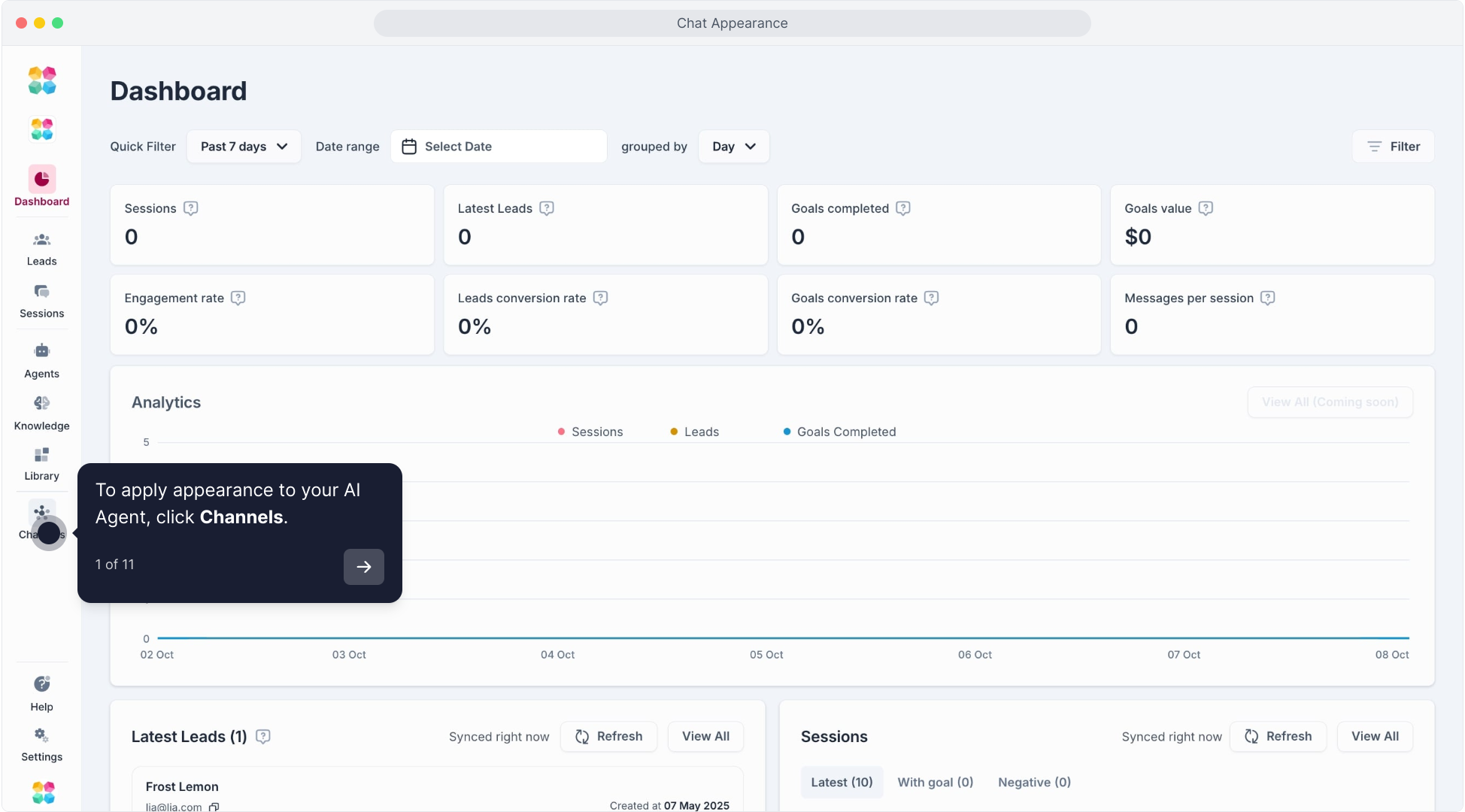 and select Chat.
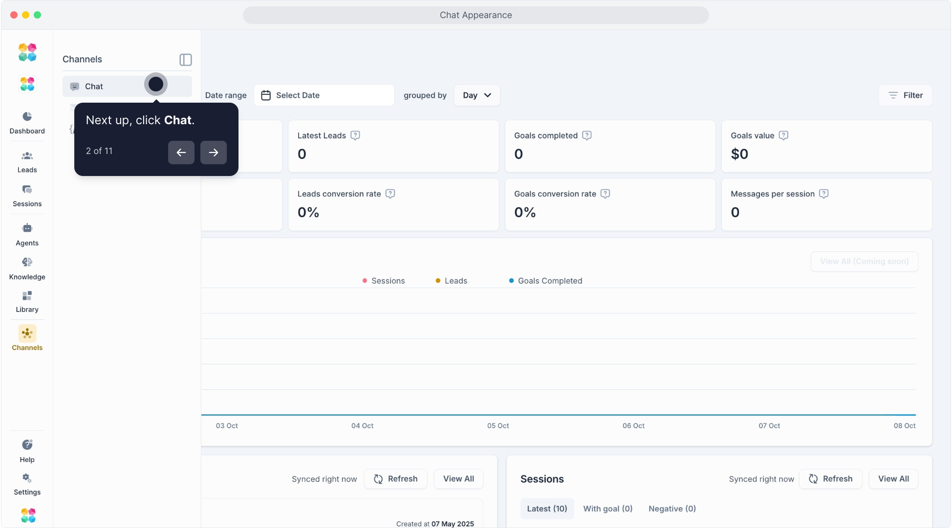 This takes you to the Chats Appearance page, where you can manage or create new chat appearances.
On the Chats Appearance page, you’ll see a list of existing appearances, like Default Appearance and any custom ones you’ve created.
To create a new appearance, click Create New.
Configuring the Chat Appearance
After selecting or creating a chat appearance, you’ll enter the Settings page for that appearance.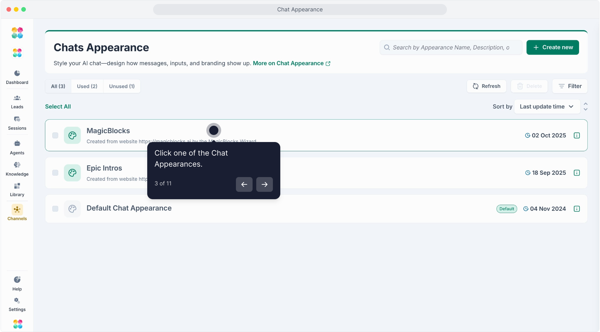
Name and Description: Provide a unique name and description to identify and explain the appearance.
Customizing Style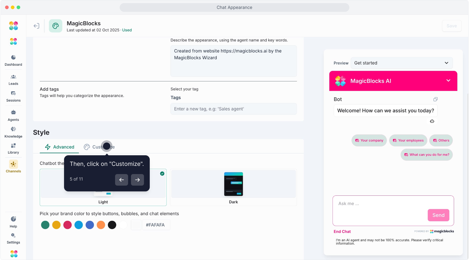
Theme: Choose between Default (Light), Default (Dark), or Custom. Selecting Custom allows you to adjust various elements to align with your branding.
Main Display:
Upload your Company Logo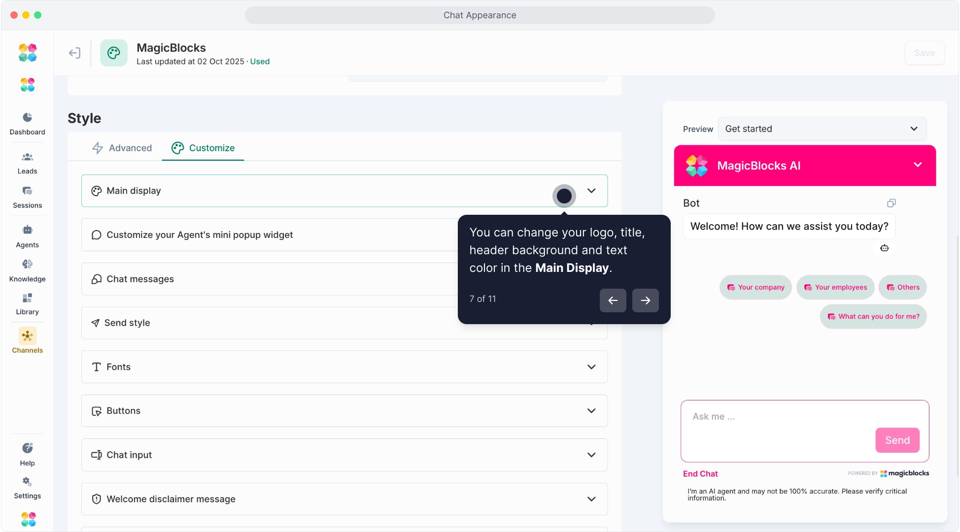 and, optionally, a Background Image.
Customize colors for Bot Title, Header Background, Header Text Color, and Chat Background.
Widget Icon: Select either a solid color or an image for the widget icon. Set its position on the chat screen and customize the Proactive Message display.
Chat Messages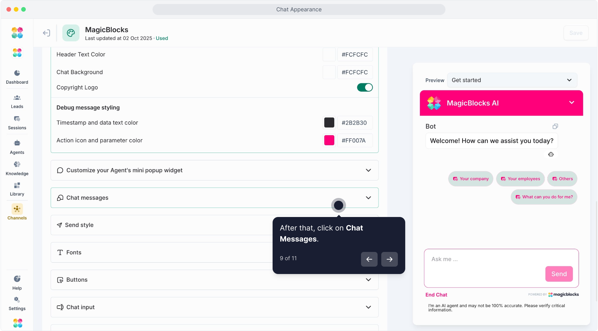
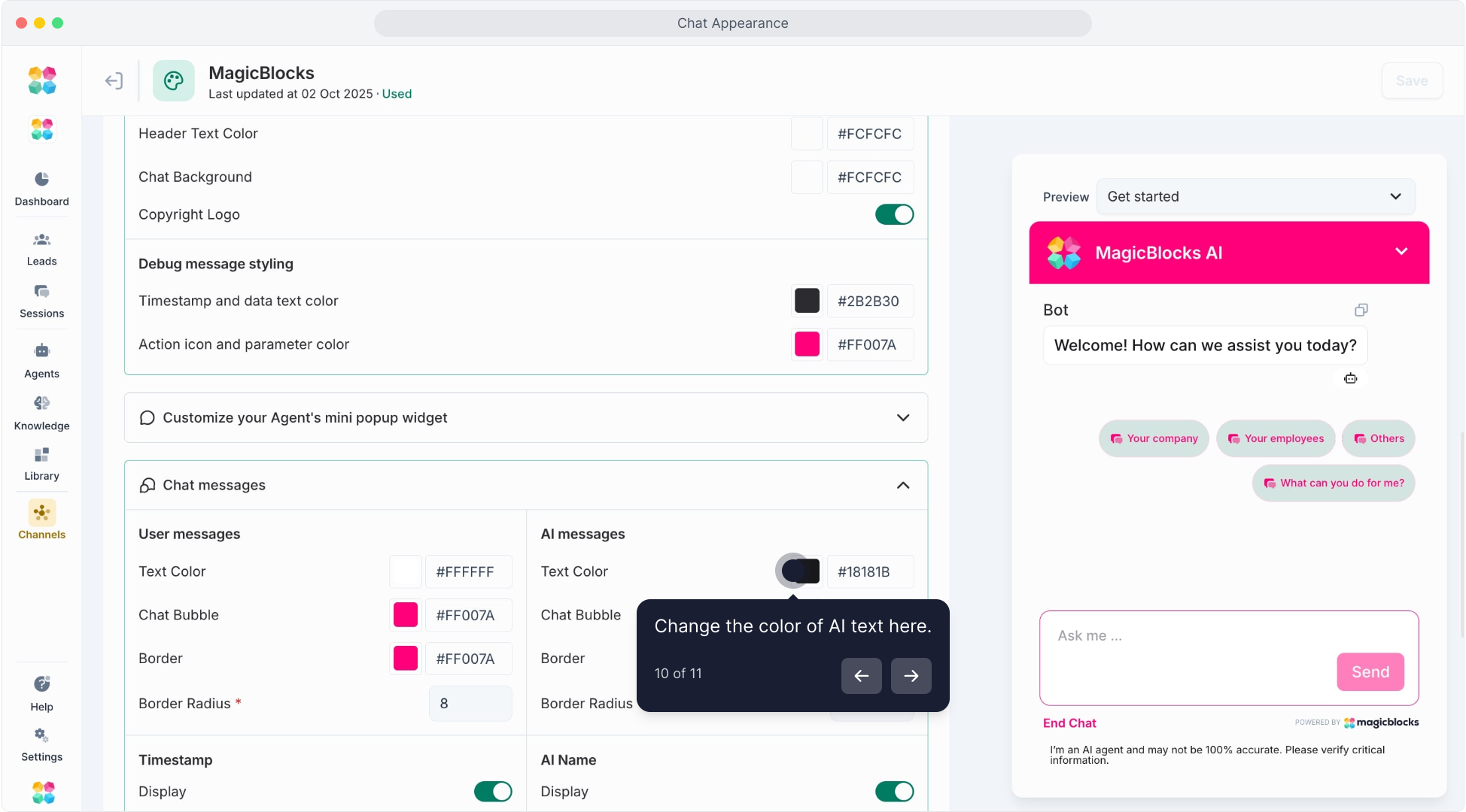
- User and AI Messages: Adjust the colors, bubble style, and border radius for both user and AI messages to ensure consistency with your brand.
- Timestamp: Toggle the display of timestamps on or off and select the format.
- AI Name: If enabled, display a custom name for the AI assistant.
- Fonts: Set the Font Family, Weight, Size, and Line Height to enhance readability and align with brand guidelines.
- Buttons: Customize Primary, Secondary, Suggestion, and Feedback buttons with preferred colors and border settings to make them user-friendly and visually consistent.
- Chat Input: Configure the colors for the Placeholder Text, Text, and Background in the input area, ensuring they’re easily readable.
- Label Editing: Modify labels for various buttons (e.g., Send Button, End Chat Button, Form Submit Button) to suit your chat’s tone and context.
- CSS Customization: For advanced customization, you can add custom CSS to further style your chat widget.
Saving Your Settings
Once all settings are configured, click Save to apply the changes.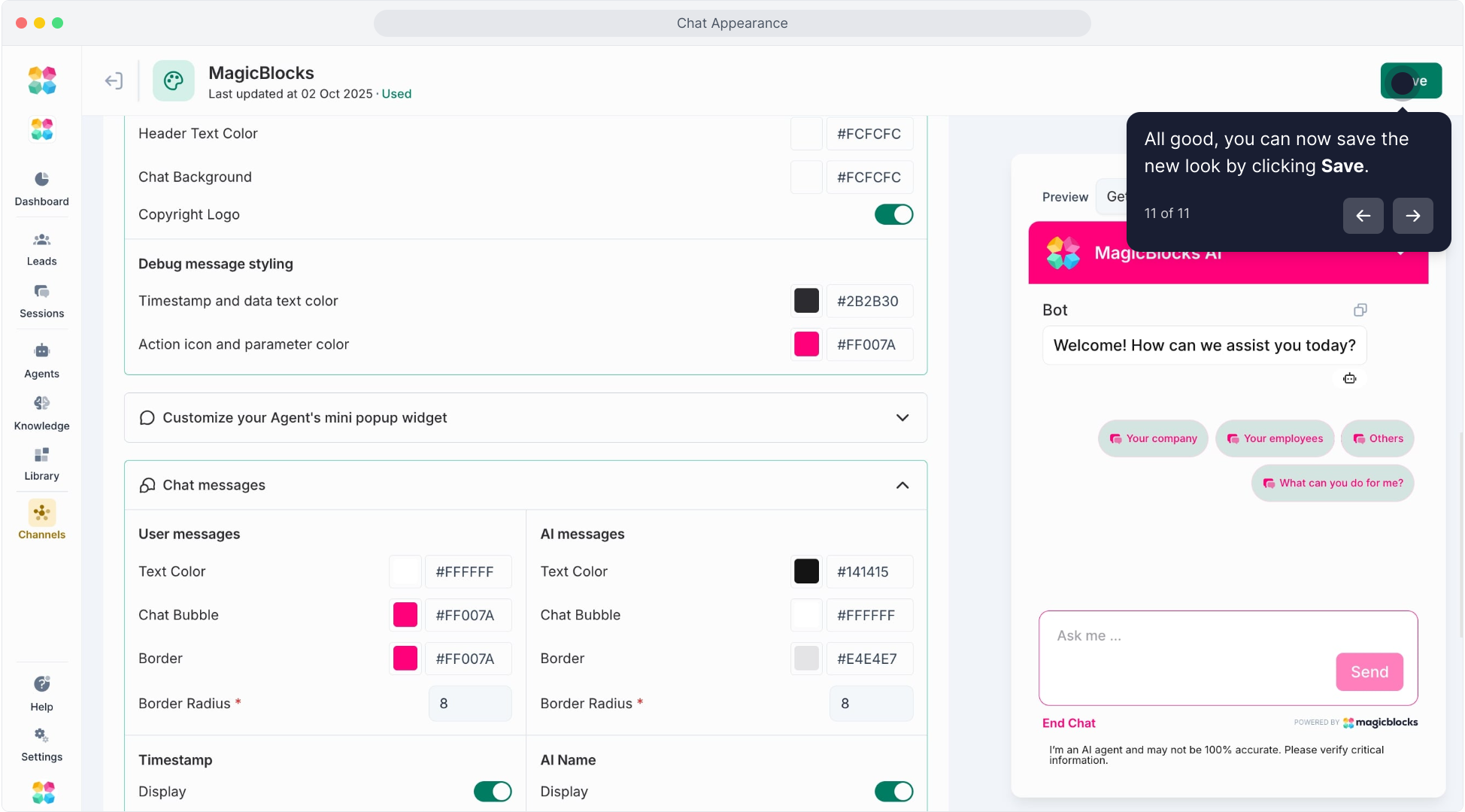
Applying a Chat Appearance to an AI Agent
Once you’ve customized your chat appearance, you need to apply it to an AI agent:
Go to Agents.
Select the Agent you want to customize.
In the Embed Settings, find the ‘Appearance’ option.
Select the desired chat appearance from the dropdown menu.
Click Save to apply the changes.